Investigating Text Legibility on Non-Rectangular Displays
summary
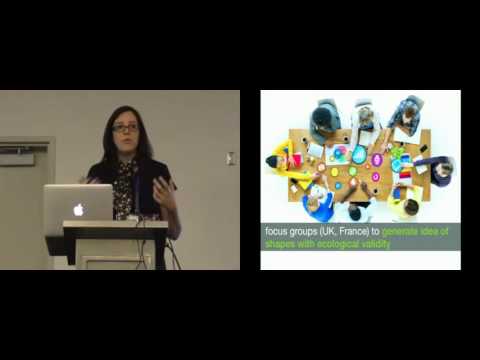
Paper reports a multi-part empirical investigation using focus groups to collect real-world non-rectangular shapes, a three-axis mapping framework, and 10 hypotheses tested in controlled quantitative legibility studies. Key results: broken layouts with holes slow reading and increase difficulty; scrollable displays let variable font size beat constant-size layouts by reducing line jumps; several common intuitions are invalidated, and a set of actionable design guidelines for text on free-form displays is produced.
AI-written summary · about
chapters (9)
- 0:00Introduction and game
- 1:57Why non-rectangular displays
- 3:02Research questions and shapes
- 5:58Mapping text on shapes
- 8:49Readability hypotheses
- 10:54Experiment setup and tasks
- 13:27Key findings and guidelines
- 15:12Future research directions
- 16:20Q&A session
related talks
 48mDesigning for Users With Low Vision
 46mRESPONSIBLE RESPONSIVE TYPOGRAPHY: A CRASH-COURSE ON VARIABLE FONTS AND ACCESSIBILITY
 50mpresentation
 33mTL;DR: Testing Copy
 51mReadability & Web: Let's build great inclusive projects
 48mBetter Type For The Web
 49mRedesigning for Cognitive Ease
 17mA case study: Accessible Design for Learning Management Systems