Error 404: Color Not found

summary
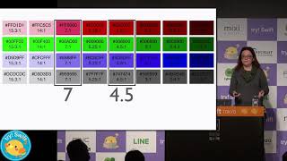
Explains why color contrast causes real exclusion, shows the math behind contrast ratios and cites WCAG thresholds: 1.4.3 minimum 4.5:1 for normal text, 3:1 for large text, AAA 7:1. Demonstrates testing tools: Windows 10 color filters, Microsoft Accessibility Insights and browser contrast plugins plus Adobe’s color analyzer, runs them against news and transit sites and finds many failures. Notes prevalence of color deficiencies—1 in 3 men—and shows simple fixes designers and developers can apply that actually improve readability.
AI-written summary · about
chapters (11)
- 0:00🚀 Build Stuff Conference – Get Your Tickets!
- 1:30Introduction to Dennie Declercq & His Work in Accessibility
- 5:00Understanding the Importance of Accessibility in Technology
- 8:30The Challenges of Color Contrast and Vision Impairments
- 12:00The Impact of Color Blindness on User Experience
- 16:00How to Measure and Test Color Contrast for Accessibility
- 20:00Real-World Examples of Color Accessibility Failures
- 24:00Tools for Ensuring Color Contrast Compliance
- 28:00Understanding WCAG Guidelines for Color Accessibility
- 32:00Practical Tips for Designers and Developers
- 38:00Final Thoughts on Accessibility and Inclusivity in Design
related talks
 06mDesign Accessibly: Color Contrast Tips and Tools
 38mRuby not red: color theory for the rest of us
 40mBeyond Aesthetics: Designing with Color for Accessibility and Inclusion
 40mYou can’t read this sentence - A11y automation
 16mColor Contrast for Accessibility
 11mThis 1 simple 600-year-old trick makes your website more accessible!
 49mInclusive Color: from Photons and Physiology to Psychology and Philosophy
 38mWeb Accessibility Deep Dive