Design Accessibly: Color Contrast Tips and Tools

summary
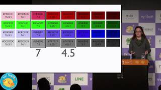
Shows concrete rules and fixes: aim for WCAG 2.0 AA contrast ratios, test every text and UI color with a WebAIM color contrast checker, and document palette combinations for light and dark themes. Cites ~10–12% male color blindness and ~10% overall visual conditions to justify prioritizing contrast. Gives examples that fail and fixes that work — blue text on black, orange-on-green golf balls, disabled-field placeholders — and practical tweaks like underlining links or adding a thin black glow; GitHub tools and simulators are shared.
AI-written summary · about
chapters (5)
related talks
 40mBeyond Aesthetics: Designing with Color for Accessibility and Inclusion
 44mError 404: Color Not found
 38mRuby not red: color theory for the rest of us
 46mAccessibility Through Visual Design
 49mInclusive Design Patterns For 2025
 16mColor Contrast for Accessibility
 22mThe designer is the problem, design is the solution
 01h 03mAccessibility: Making your websites more inclusive