Modularizing your Android UI with Style Guide-Driven Development
summary
Grubhub builds a reusable Android style system: an Android pattern library (library + sample app) that houses versioned UI components used across four Android apps serving 20.3 million diners daily. Buttons become a single custom Button extending AppCompatButton with attributes for type/size/color, supporting programmatic drawable/state generation and on-the-fly custom color schemes so consumers avoid creating many XML files. Versioning lets apps opt into changes, migration to Material Button stays simple, and unified naming plus UX research improves consistency and accessibility.
AI-written summary · about
chapters (10)
- 0:00Introduction and motivation
- 2:56Living style guide concept
- 6:02Style guide driven development
- 7:05Android pattern library setup
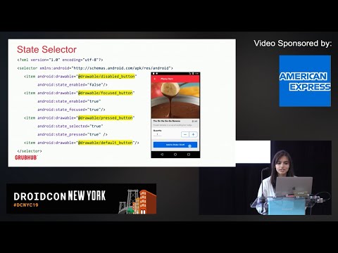
- 10:54Custom button implementation
- 16:27Library evolution and flexibility
- 17:49Unified terminology across platforms
- 19:33Getting started with the approach
- 22:00Key stakeholders and training
- 23:42Conclusion and Q&A
related talks
 36mBuilding UI Consistent Android Apps
 37mConsistency is Key - Working with a Design System
 36mConsistency is Key - Working with a Design System
 44mThe Curious Case of Android Button
 26mA Practical Guide to Material Design implementation for Android Developers
 44mThe Curious Case of Android Button
 43mCustomizing Theme and Style for Material Design
 21mHow We Built the Android Design System for The New York Times