Accessibility-flavored React components...
summary
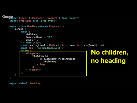
Design system is a React component library in beta that enforces accessibility guardrails: components must pass semantic HTML, ARIA and documentation before release. Specifics include choosing an icon font workaround after an SVG-sprite VoiceOver bug on High Sierra, an icon component with default iconHidden=false plus library lookup and default alt text, button components that use native <button> with children, onClick and disabled props, inputs that use htmlFor, aria-describedby linking to error ID with polite aria-live, and a heading component with a heading level prop validated 1–6 and separate presentation class. WCAG 2.1 AA is the target.
AI-written summary · about
chapters (10)
- 0:00Start
- 2:48Topics covered
- 5:39The Four Principles of Accessibility
- 6:14POUR yourself a coffee
- 9:08You are the cook
- 10:30Component recipe
- 37:38Don't leave your screen reader users hungry
- 45:50Dedicate a page to accessibility links
- 46:03Your Design system is a cookbook
- 46:26Document, document, document
related talks
 40mAccessibility-flavored React components make your design system delicious
 28mBuilding Accessible React Components
 30mDesign Systems are a Carnival! One Accessible Component, Many Pretty Masks
 25mAccessibility in the Age of Components
 34mBuilding Accessible Components in React
 41mDemystifying Accessibility in React Apps
 26mDemystifying Accessibility in React Apps
 36mAccessibility in React Application