Solving Layout Problems with CSS Grid and Friends

summary
Explains that CSS Grid is a true two‑dimensional layout system that defines column and row tracks on the container and lets items span tracks instead of sizing items manually; shows using fr unit and minmax() with auto-fill to create responsive columns, using grid-auto-rows plus object-fit for adaptable media, and sizing keywords like min-content, max-content and fit-content. Covers fallbacks (flexbox, floats, display:table-cell), using feature queries to overwrite old rules, and limitations: nested grids not aligning, subgrid proposals, and masonry vs auto-flow dense reordering.
AI-written summary · about
chapters (14)
- 0:00Introduction to CSS Grid
- 1:02Grid vs Flexbox
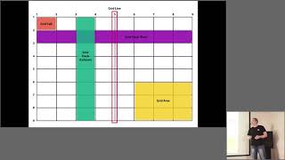
- 2:17Grid Fundamentals
- 5:54Avoiding Grid Frameworks
- 7:06Auto-sizing Tracks
- 8:46Using the FR Unit
- 11:04Advanced Minmax Techniques
- 13:33Nested Grids
- 14:41Content Sizing Keywords
- 17:34Supporting Old Browsers
- 20:54Feature Queries
- 22:59Future Grid Features
- 25:43Grid and Masonry Layouts
- 27:38Resources and Conclusion
related talks
 30mSolving layout problems with CSS Grid and friends
 31mSolving layout problems with CSS Grid and friends
 43mSolving Layout Problems With CSS Grid and Friends
 29mLaying Out The Future With Grid And Flexbox
 58mCSS Grid - What is this Magic?!
 26mWhy CSS Grid is a game changer for web design
 52mCSS Grid in Detail
 51mCSS GRID LAYOUT - PRACTICE TRICKS