CSS GRID LAYOUT - PRACTICE TRICKS
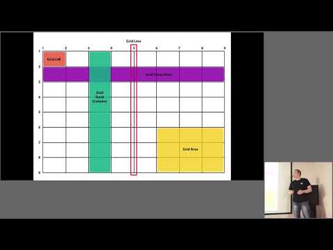
summary
CSS Grid can largely replace float/inline-block layouts and reduce reliance on JS masonry. The talk demonstrates a portfolio layout built with grid-template, gap, fr and minmax, including responsive reflows using named grid areas and breakpoints, explains placement control via grid-auto-flow and span and techniques to fill gaps, and notes growing browser support (about 32% to 88% in a year) while recommending flex/float fallbacks for Edge/IE incompatibilities.
AI-written summary · about
chapters (33)
- 0:00Introduction
- 3:21CSS Grid in 2017
- 7:02Layout problems before Grid
- 10:59What is CSS Grid
- 12:26Grid columns and rows
- 13:31Gaps in CSS Grid
- 14:13Fr units in layouts
- 15:17Repeat property
- 16:00Span for sizing
- 16:45Empty space with grid-auto-flow
- 17:31Mobile layouts with auto columns
- 18:35Min/max sizes in Grid
- 19:19Full-row elements
- 20:01Named grid lines
- 21:07Grid areas
- 23:38Two-column layout
- 25:25Adding footer
- 26:07Mobile adaptation
- 26:49Desktop to tablet
- 28:17Old browser issues
- 30:50Grid browser support
- 33:01Grid vs Flexbox
- 37:52Grid vs Flexbox use
- 39:45Grid with media queries
- 40:51Grid with other techniques
- 41:55Backend data for layouts
- 43:23Aligning uneven heights
- 44:10Size mismatch fixes
- 46:03Dynamic layout changes
- 47:35Grid limitations
- 48:40When to use Flexbox
- 49:04Order property
- 50:27Q&A