Mediaqueryless Responsiveness

summary
Claims concrete replacements for breakpoints: use floats and multi-column layout so columns auto-fit with a min-width, let the browser pick counts instead of adding media queries, and combine v-max/view-port units and flexbox to size blocks by viewport ratio. Demonstrations include a live photo blog, an automated art generator that publishes about 4,500 books, a conferencing grid made from speaker images, and interactive behaviors driven by :target and quantity selectors — all implemented and shown to work.
AI-written summary · about
chapters (10)
- 0:00Start
- 12:07Media Queries
- 14:47Multi-Column Layout
- 20:01Layout on-Demand
- 21:03Target Selector
- 22:31Caption
- 25:21Flexbox
- 25:44Mix Blend Modes
- 33:24Media Query Syntax
- 40:27Why There Are Not that Many Artists on the Web
related talks
 13mBreaking Out of Media Queries
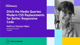 35mModern CSS Replacements for Better Responsive Code
 23mThe End of Media Queries
 45mHow Responsive Are You in CSS? 2026 Edition
 01h 01mThe Evolution of Responsive Web Design: What's Next?
 49mPanel 4: Responsive Layout
 40mFuture-Proofing Responsive Web Design in 2023
 37mEnhancing Responsiveness With Flexbox